
Photo by Vitaly Gariev on Unsplash
“A brand is supposed to feel boring at first.”
I’ve heard this argument a few times, and it’s always given me the heebie-jeebies.
It sounds wise, and it sounds mature, but more often than not, it’s used to defend work that’s deliberately restrained or work that simply didn’t push far enough.
Brands don’t need to be loud, bold, or in your face to be successful. A strong brand system can absolutely be a quiet one. But it should never be boring.
Quiet v. Boring Branding
A quiet brand still has a point of view, whereas a boring brand is what happens when restraint isn’t paired with conviction.
Quiet Branding
Makes deliberate decisions about what to say or not say
Feels composed, not apologetic
Not the centerpiece, but still unmistakably in the room
Boring Branding
Is vague instead of clear
Avoids risk rather than managing it
Feels interchangeable
Longevity ≠ Neutrality
I agree, brand systems designed to last should not rely on novelty, which is where I think this premise originates—the idea that brands have to be seething with big personality, which simply isn’t true.
Brands should be designed to scale and work well under pressure, but longevity comes from brand strategy, not from simply being “unforgettable.”
The best brand systems, when stripped down to their studs, are still recognizable.
So, longevity is about clarity, consistency, and repeatable patterns, not absence of personality.
In Practice: Mastercard’s 2016 Rebrand

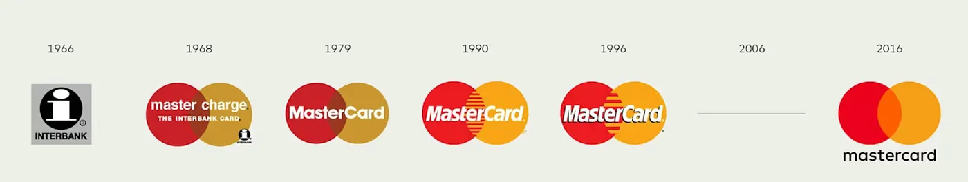
During Mastercard’s 2016 rebrand, many called it boring and underwhelming. The social response summed it up as just flat circles and a lowercase wordmark. No fireworks. No ballons. No cake. No big pizazz.
Branding isn’t just about cosmetics; it’s about strategy. Mastercard’s rebrand wasn’t trying to be a novelty or reinvent their identity. It was trying to distill and simplify.
In this rebrand, they stripped out everything but the most recognizable asset: the overlapping circles, and rebuilt the entire brand system around that asset.
The logo was recognizable without the type inside it, and the shapes became a visual language through motion and sound.
They weren’t playing it safe. They were deliberate.
That was quiet branding done well.
A decade later, that system still holds. The visual language is still intact. The most recognizable core asset is still doing the heavy lifting and used effectively on their homepage.
Loudness Isn’t the Problem
Brand systems don’t fail because they’re too loud or too quiet.
A loud brand can be strong if the foundation is strong, it holds up across contexts, and its boldness is rooted in concept not decoration. A quiet brand can be fragile if there’s nothing anchoring it, and it lacks point of view.
So, the real question isn’t “should we have a big, loud brand personality or a quiet, restrained brand personality?” but “how do we build a brand system that can survive real use?”
The Real Test
A brand is not supposed to be boring at first. For a decision this big, you can’t put all your eggs into the “it’ll grow on us” basket.
A good brand system might not immediately impress. And that’s fine. The goal of branding isn’t to satisfy your personal design preferences, but to solve a broader business problem. But it should still register.
Ask yourself these questions:
Is there a clear idea I can articulate?
Is there a decision that feels opinionated?
Is there a constraint that creates tension?
Is there something I want to look at twice?
If you’re answering “no,” then don’t launch!
Don’t Confuse Maturity and Blandness
Design maturity isn’t about sanding everything down. That only takes away valuable perspective.
A rebrand doesn’t need to shout, but if it has nothing to say at all, it’s already failed.
More Articles
A collection of recent articles spanning brand strategy and positioning, brand design, and more.

