
Sandra Görg
SERVICES
Print Design, Graphic Design
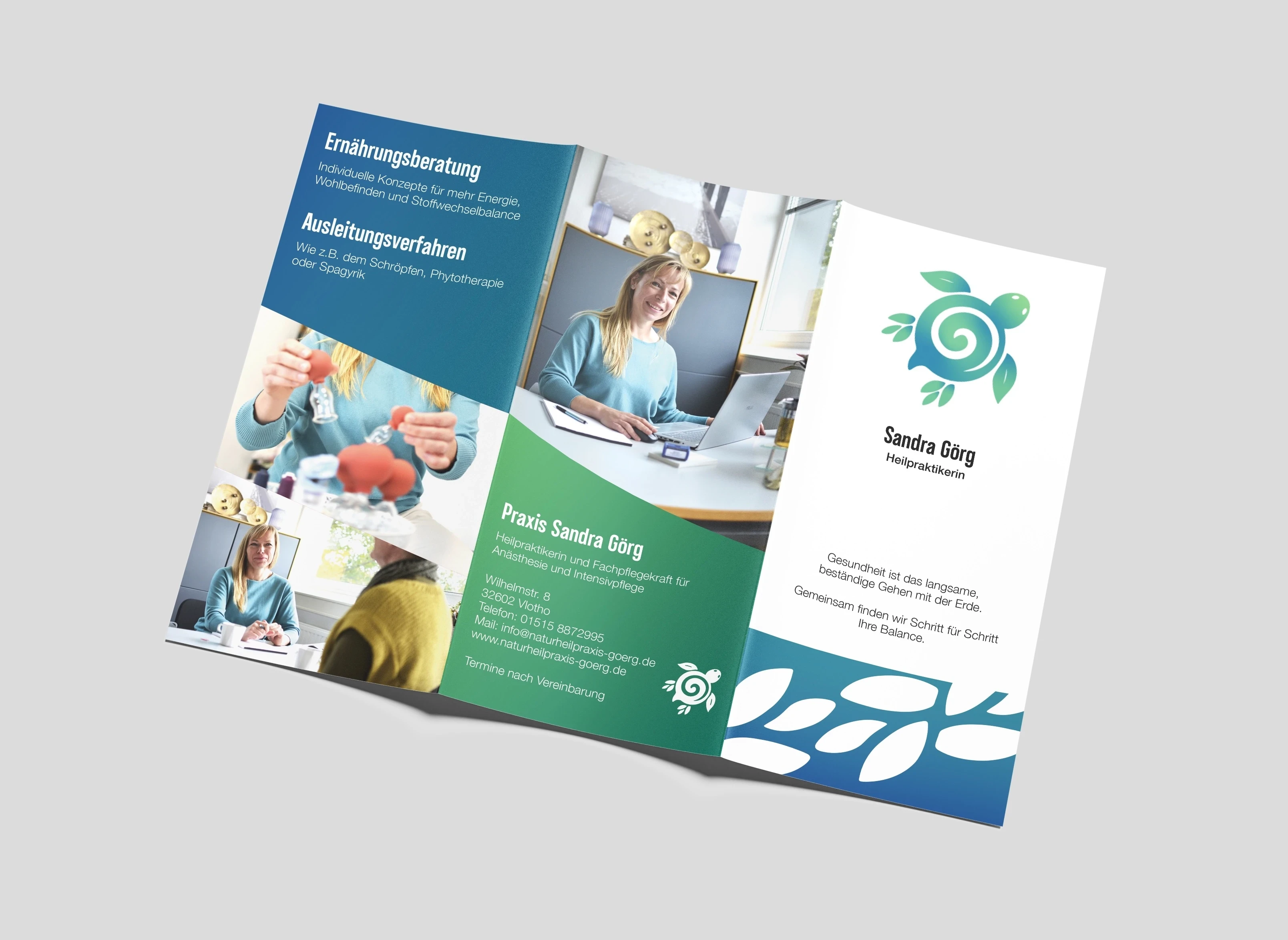
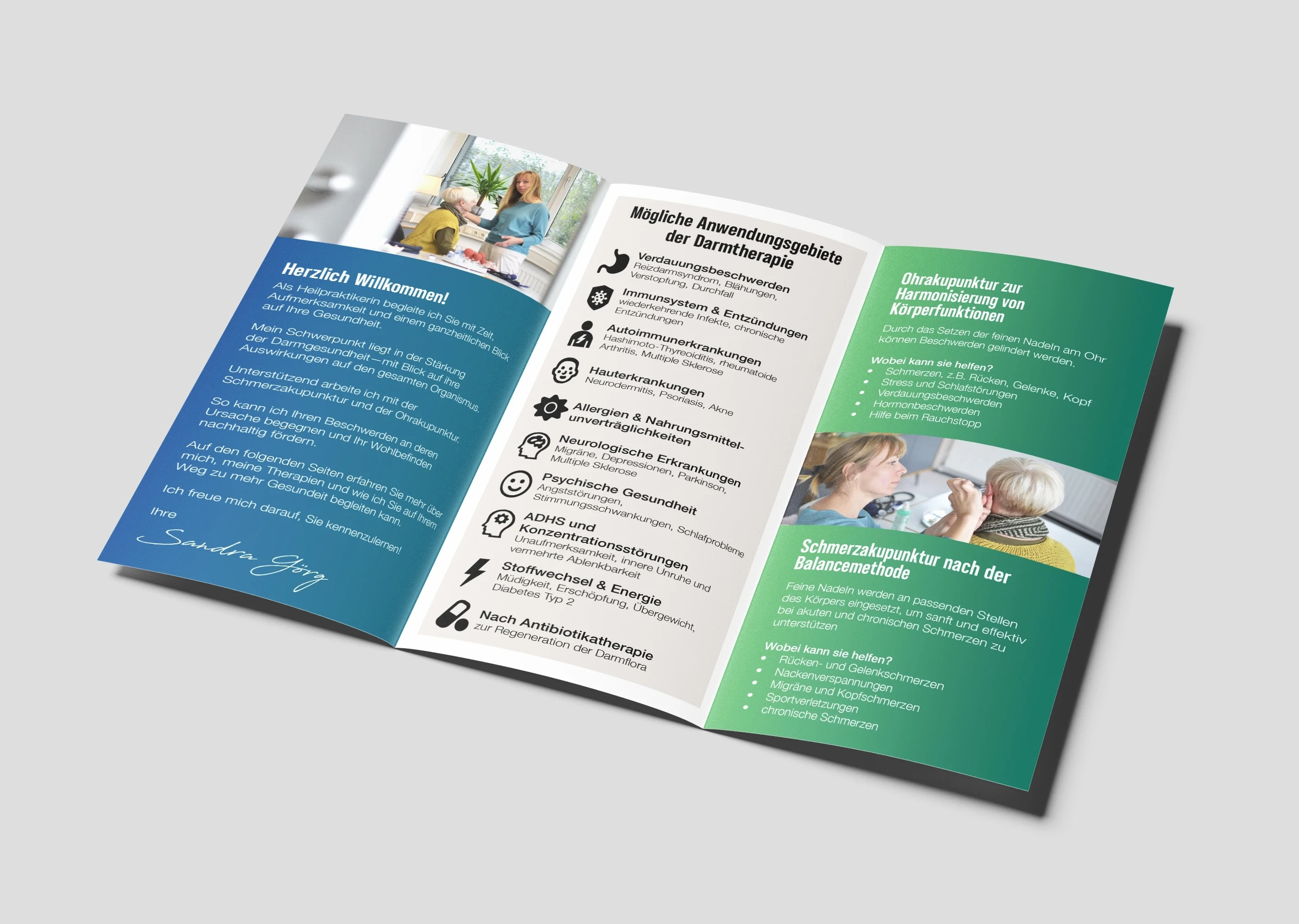
When Sandra Görg, a Heilpraktikerin and former ICU nurse, decided to open her own naturopathic practice, she wanted a brochure that could introduce her services with warmth and authenticity. She needed a cohesive design that captured her compassionate, patient-centered approach. The final brochure blends clarity with emotional resonance—grounded
in her philosophy of balance, connection, and gentle healing. I started by exploring how Sandra’s story and message could be expressed visually through composition, type, and color. Drawing inspiration from her logo, I built a complementary color palette and used gradients to mirror the organic transitions found in nature and in her treatments.
The front cover features a custom path pattern derived from the turtle’s feet in her logo—a subtle symbol of her motto, “Health is the slow, steady walk with the Earth.” Thoughtful typography, human-centered imagery, and reconstructed icons all work together to communicate empathy, professionalism, and calm confidence.
"You understood my vision perfectly and also contributed great ideas of your own to the layout, resulting in a clear, well-structured design with a beautiful color concept."
Sandra Görg, Heilpraktikerin


